When you first open an auto clicker, the main interface may appear simple, but every option consists plays a important role in determining how the tool functions.
If you’re new to auto clickers, understanding the primary interface step by step will make it much easier to set up and use them effectively.
From click intervals and click types to hotkeys and cursor positions, each section is designed to give you control over how and where your clicks are performed.
The beauty of an auto clicker lies in its flexibility—it allows you to automate tasks exactly the way you want. Whether you’re a gamer who needs rapid clicks, a tester checking software responsiveness, or someone tired of repetitive form submissions, the main interface is where everything begins.
In this guide, we’ll break down each part of the auto-clicker interface so you can use it with confidence. No technical background is required—just a little patience and the willingness to explore. By the end, you’ll know precisely what every option means and how to use it to your advantage.
Auto Clicker UI Window Overview
Clean, Professional Design
A fixed-size window (600×405) with a trendy light theme suited for clarity and use is a feature of an auto clicker. Each control is positioned carefully to facilitate an efficient workflow.
1. Interface Sections
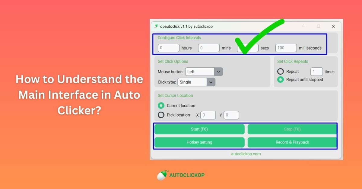
📊 Click Intervals Section
- Location: Top section
- Purpose: Configure timing between clicks using hours, minutes, seconds, and milliseconds
- Controls: Four input fields with clear labels
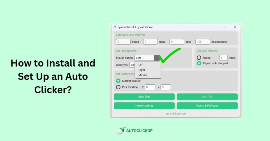
2. 🖱️ Click Options Section
- Location: Left middle section
- Purpose: Select the mouse button and click type
- Controls: Dropdown menus for button and type selection
3. 🔄 Click Repeats Section
- Location: Right middle section
- Purpose: Set how many times to click or run continuously
- Controls: Radio buttons and numeric input
4. 🎯 Cursor Positioning Section
- Location: Lower middle section
- Purpose: Choose the click location method
- Controls: Radio buttons and coordinate inputs
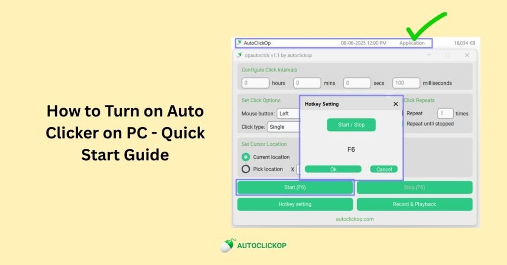
5. 🎮 Control Buttons Section
- Location: Bottom section
- Purpose: Start/stop automation and access features
- Controls: Large, clearly labeled action buttons
Available Website Address
- Location: Located at very bottom
- Purpose: Link to official website/support
- Controls: Clickable website link
Control Details Present in UI Window
Various Input Fields
Placeholder Text: Shows default values and expected input format
Validation: Automatic validation prevents invalid entries
Clear Labels: Each field is clearly labeled with its time unit
Keyboard Navigation: Tab between fields for efficient data entry
Dropdown Menus
Mouse Button: Left, Right, Middle options with clear icons
Click Type: Single or Double click with behavior descriptions
Default Selections: Pre-set to most common use cases
Functional Action Buttons
Start Button: Large, prominent button with hotkey display
Stop Button: Disabled until clicking starts, then becomes the primary control
Hotkey Setting: Opens a dialog for customizing keyboard shortcuts
Record & Playback: Access to advanced automation features
Visual Design Elements
🎨 Design Philosophy
The interface features a light theme with blue accents, providing optimal readability and a professional appearance. Colors and spacing are designed to reduce eye strain during extended use.
Color Scheme
Primary Background: Clean white for main content areas
Section Backgrounds: Light gray for visual separation
Accent Color: Professional blue for buttons and highlights
Text Colors: Dark gray and black for optimal readability
Typography & Spacing
Font Family: System fonts (Arial, Segoe UI) for consistency
Font Sizes: Hierarchical sizing for clear information structure
Spacing: Generous padding and margins for comfortable interaction
Alignment: Left-aligned text with centered controls for balance
Top Accessibility Features in AutoClickers
♿ Built-in Accessibility
High contrast text and backgrounds
Large, easily clickable buttons
Clear visual hierarchy
Keyboard navigation support
🔤 Text & Visual
Readable font sizes throughout
Clear section divisions
Consistent button styling
Logical tab order for navigation
Final Thoughts
An auto clicker’s main interface may appear complicated at first, but it becomes shockingly simple as you figure it out step-by-step. Each feature, such as allocating hotkeys, choosing between single and double clicks, and modifying the click interval, contributes to the seamless operation of your automation. With the knowledge you’ve gained from this tutorial, you may now securely adjust settings and tailor the auto clicker to your own needs. You’ll get more at ease and it will become second nature as you continue to try. Recall that the purpose of an auto clicker is to ease chores you don’t want to perform manually, saving you time, and lessen repetitive strain. Make responsible and prudent use of it, particularly in areas where automation offers benefits. You’re prepared to experiment with more sophisticated capabilities, test out various use cases, and make the most of this strong yet user-friendly tool now that you have a firm grasp of the main interface. Now go ahead and launch your auto clicker, adjust the parameters, and gradually make automation work for you.